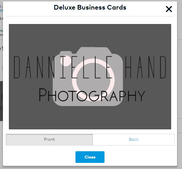
Using my research I designed my promotional item – my business cards. As shown by my research, I decided to simply use my logo as the front cover of my card. I felt that this was clear, simple yet effective and would capture the attention of the audience. I decided to make my writing within my logo raised to give my business card texture and depth, so
not to be just a flat card.
Humans are often inspired by their sense of touch which is another reason for this conscious decision. I also decided to make the logo itself have a glossy finish, making it stand out from the matte background, which I found aesthetically pleasing and believed would be something that would attract attention, particularly as I have been leaving the cards within pubs and shops.
As a photographer I felt my card should be particularly visual so used symbolism on the
back cover to show where places where I can be found and contacted. This also saved space on my business card which was important as some of my naming is quite long – something I wish I had reconsidered as this makes it quite complicated to find me online.
I feel that maybe I used too much information on the back and should have stuck to maybe the key places of contact that would lead to other platforms, such as phone number, email and website, however it is useful to keep all of this information visible for potential customers who may only use one or two of the provided platforms.
I kept the overall colour simplistic and consistent to fit with my theme. I found that subconsciously my website was also quite monotone, so my business card reflects my
over visual branding. I am in debate as to whether I should redesign my business card
to have a white background as I feel that the writing is a little hard to read.